User interface
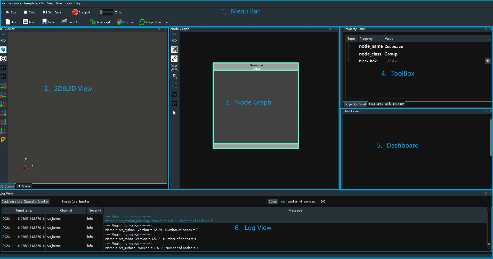
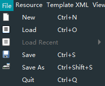
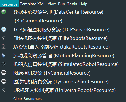
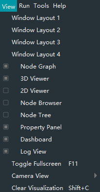
Menu Bar: includes software toolbar, motion control bar, file management bar.
2D/3D View: Select the option of **2D View |3D View ** at the bottom of the window to switch to 2D window |3D window.
Node Graph
Property Panel/Node Tree/Node Browser:Select the option of Property Panel/Node Tree/Node Browser at the bottom of the area to switch to the specified interface.
Dashboard
Log View
The following describes the Menu bar, 2D View, 3D View, Node Graph, Property Panel, Node Tree, Node Browser, Dashboard, and Log View of the software in detail.
2D View
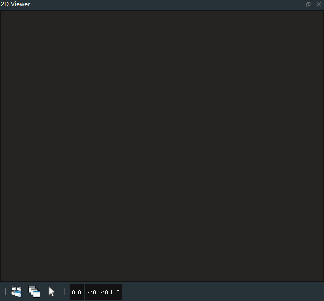
Operations & Information bar
The Operations & Information bar is located below the 2D view. Includes:
 Tiled Sub Windows:Tile multiple image Windows in a 2D view.
 Cascade Sub Windows:If there are multiple image Windows, layer the image Windows in a 2D view.
 Normal Mode:ROI area specified box to choose, and TyROISegment node.
Pixel position:When the mouse moves to the target position of the 2D image, the position information 0X0 of the current pixel is displayed at the red mark in the above figure.
Pixel rgb:When the mouse is moved to the target position of the 2D image, the yellow label above shows the rgb information r:0 g:0 b:0 of the current pixel.
3D View
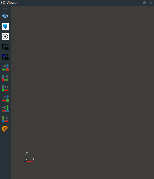
View operation
Translation:Move the mouse over a 3D view, hold down the middle mouse button, and drag to pan the 3D view.
Reduce/Enlarge:In the 3D view area, scroll the middle mouse button to zoom out/zoom in on the 3D view.
Rotate:Click the action bar button
 ,Select a point in the 3D view as the rotation midpoint, and hold down the left mouse button to move, you can rotate the 3D view.
Shortcut menu
Right-clicking on an empty space in the 3D view will bring up a shortcut menu, including:
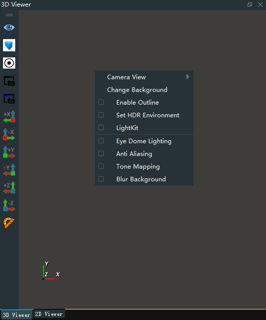
Camera View:Used to save, load, and clear view angles with one click. You can save up to 5 view perspectives. You can also use the shortcut key D to save the current view and the shortcut key L to load the view.
Change Background:Change the background color of the 3D view.
Enable Outline:When the display outline is turned on, click on models such as point clouds and robots in 3D view, and their Outlines are highlighted. This feature requires the 3D view background to be set to a dark tone.
Set HDR Environment:Load HDR ambient light from a local file.
LightKit:Map ambient light effects for point clouds.
Eye Dome Lighting:Set 3D point cloud light effect.
Anti Aliasing:Edges are softened to eliminate aliasing.
Tone Mapping:Set the background with different tones of the object to emphasize the object.
Blur Background:Blur the background and highlight the object.
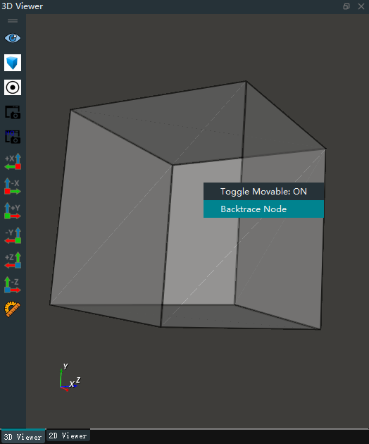
In the 3D view area, if you need to find the corresponding node through a display object, you can right-click on the display object and select traceback node, at this time, the node diagram will automatically focus on the output of the display object node.
Panel
Operator properties panel after setting output data visualization( →
→ ![]() ),The visualization results of the corresponding nodes can be seen in the 3D view. At this time, the left mouse button double click visual results will pop up the corresponding panel. Some visualizations do not have corresponding panels.
),The visualization results of the corresponding nodes can be seen in the 3D view. At this time, the left mouse button double click visual results will pop up the corresponding panel. Some visualizations do not have corresponding panels.
LoadPoselist|LoadPointCloud|LoadCube
The LoadXXXlist panel is similar. The following uses LoadPoseList as an example:
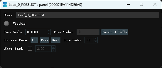
Name:Panel name。
Visible:Set the visibility of Poselist.
Check:Displays the current Poselist.
Uncheck:Turn off visualization.
Pose Scale:The display size of Poselist can be adjusted by entering the required ratio in the input box Enter or by
up and down key.Pose Number:The current number of Pose in Poselist.
PoseList Table:After clicking, all Pose information of Poselist will be displayed. When the left mouse button is clicked, the corresponding Pose will also be enlarged.
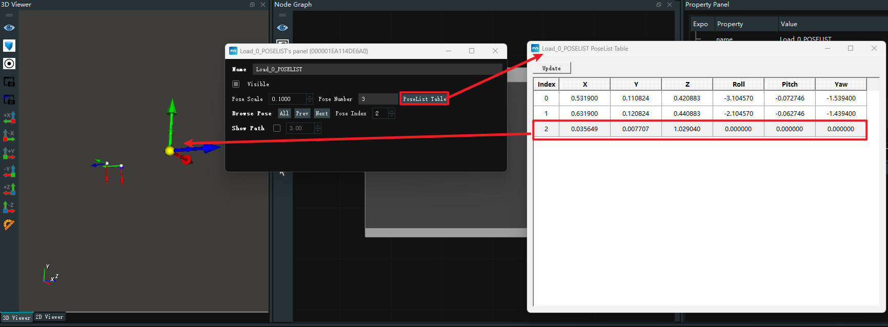
Note: In LoadCubeList and LoadPointcloudlist, when you click the row details, the corresponding Cube/Pointcloud is highlighted.
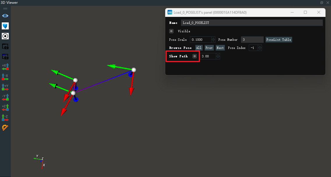
Browse Pose:When clicking
PrevorNext, the corresponding Pose will be highlighted. At the same time, the coordinate index will display the current Pose index.Show Path:Line according to the order of the index, enter the required proportion in the input box after Enter or through the ‘up and down key’ can adjust the line width.
LoadPointCloud|LoadPose|LoadCube
The LoadXXX panel is similar. The following uses LoadPointCloud as an example:
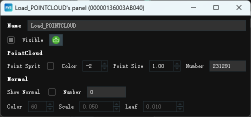
Name:Panel name.
Visible:Set the visibility of the point cloud.
Check:Displays the current point cloud.
UnCheck:Turn off point cloud visualization.
 :To export the current point cloud, click the button to pop up the
 Export PointCloudpanel. ClickOKto save the point cloud to the runtime directory file. Click ‘Cancel’ to cancel the export.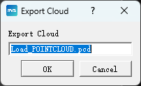
Point Spri:Fast particle rendering.
Check:Open the Point Spri. The color or point size parameters need to be adjusted to send changes.
Uncheck:Close point Spri. The color or point size parameters need to be adjusted to send changes.
Color:The color of the point cloud can be adjusted by Enter or
up and downafter entering the desired scale in the input field. Value range: [-2,360].-2:Point cloud original color.
-1:Random color in point cloud 0 to 360.
0~360:Pseudo color.
Point Size:The size of the points in the cloud can be adjusted by Enter or pressing the
up and downbutton after entering the desired scale. Value range: [1,50].Normal:
Show Normal:
Check:Displays the pointcloud normal vector.
Uncheck:Close the pointcloud normal vector.
Number:The number of normal vectors.
Color:The color of the normal vector.
Scale:Display ratio of normal vector.
Leaf:The sparsity of the normal vector.
EmitCube|EmitPose
The EmitXXX panel is similar. The following uses EmitCube as an example:

Name:Panel name.
Visible:Sets the visibility of the cube.
Check:Displays the current cube.
Uncheck:Turn off visualization.
width/Height/Depth:The length/width/height of the cube can be adjusted by entering the required ratio in the input box Enter or by the
up and down keys. After you adjust the value, press Enter. The adjusted cube is displayed in the 3D view.Move Pose:Move coordinates to a certain position and click after moving
 button to confirm the change, click
  give up the mobile.
Check:The center point of the cube shows the moving coordinates, and the left mouse button can be held down one of the axes to drag or rotate.
Uncheck:Turn off moving coordinates.
Ref Scale:After entering the required proportion in the input box Enter or through the
up and down keyscan adjust the display proportion ofmoving coordinates.
Node Graph
From the point of view of the node graph, it will be divided into two regions: Resource and Main.
MainGroup:The entire node graph area is a Group, namely MainGroup. MainGroup is unique, and all the groups, nodes and lines we add are operated within the MainGroup.
ResourceGroup:The Main Group contains another special Group: ResourceGroup, the Group is also globally unique, and its internal four corners have no port area, the Group is stored inside the resource class nodes, no connection between the internal nodes , each resource class node is an independent thread for the underlying data interaction. Once the resource class node is created, even if the resource class node is not dragged into the ResourceGroup, it still belongs to the ResourceGroup. In this case, drag the ResourceGroup to move. You can see that resource nodes that are not dragged inside ResourceGroup are also moved.
The MainGroup and ResourceGroup cannot be manually created and deleted. Each time a new xml is created, a MainGroup and ResourceGroup are automatically created.
Action bar button
Action bar buttons are on the left side of the node diagram, including:
 View All:All nodes and groups are displayed at appropriate scaling ratios to maintain appropriate screen ratios.
 Group Selected Nodes:Combine the selected nodes into a Group.
 UnGroup Selected Nodes:Uncombine the selected Group.
 Focus Selected Nodes:Brings the selected node and Group into focus.
 AutoLayout Mode:Layout switch when expanding Group when Group contains Group.
 Enable All Edges :When there are disabled connections in the xml, click this button to enable all connections. For disabling features, see the [Operator Connection Shortcut menu](#Operator Connection Shortcut menu).
 Updatte Graph :Refresh the node graph. Refresh all nodes that are already green (finish state) to gray (idle state).
Note: The node graph does not always iterate to refresh the display. When some node parameters are changed, the appearance of the node may not take effect in time. In this case, you need to click the button
 to refresh the display.
 Screenshot:Save the current node diagram in png format in the runtime folder in the RVS installation directory.
 Select Mode:The default mode is single mode. In this case, you can drag one or more nodes. When you click to switch to multiple selection mode, you can select multiple nodes to form a Group more quickly.
Note: The node cannot be moved in multiple selection mode. If you want to move the box after selecting it, switch the mode to single option.
Property Panel
Node Property Panel
Click an node in the Node Graph, and the property panel will display the corresponding node property parameters, including:
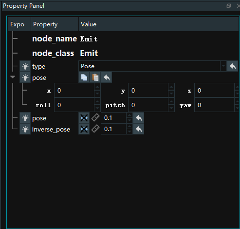
node_name:The Node name of the Node. Double-click the mouse to change the node name, Enter and press Enter to confirm the change.
node_class:The node type of the node.
Other node properties:
 Input attribute exposure:Bulb
 Output type attribute exposure:Eye
 Visual open:Eye
 Visual close:Close your eyes
 Staff:Size
 Opacity:Transparency of visual properties
 Color:Visualize the color of the property
 Copy:Copy pose
 paste:Paste pose
 Reset:Reset to the default value of the parameter
 Click to selet:Select a file or directory name
Group Property Panel
Click on a Group in the Node Graph, and the property panel will display the corresponding Group property parameters, including:
node_name:The name of the Group. Double-click the mouse to change the Group name, Enter and press Enter to confirm the change.
node_class:Group type.
Black_box :Whether to encrypt the Group.
True:Encrypt. The Group cannot be expanded after encryption.
False:No encryption. You can view the Group connection logic after entering the password.
Node properties of the output: The properties of some nodes in the Group need to be exposed and output, and these nodes properties will be displayed in the Group properties panel for easy parameter adjustment.
Operation procedure:
Step one:Exposes the
filenameattribute in the LoadCloud Node in LoadCloud Group→
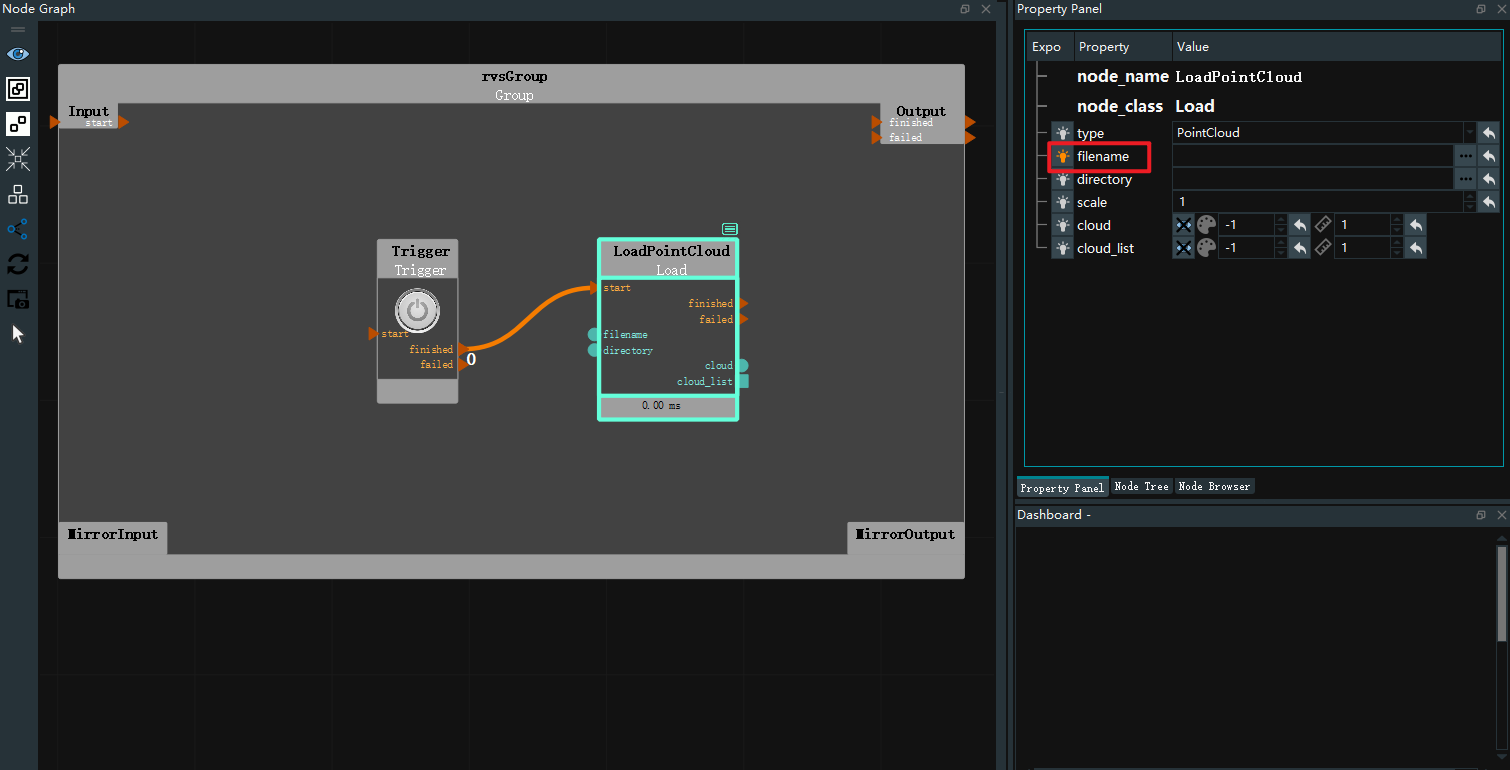
Step two:Mouse right click LoadCloud Group blank area, pop-up menu bar, select
Group parameters panel, pop-up Group parameter panel. Check Whether output is output. ClickUpdateto close the panel window.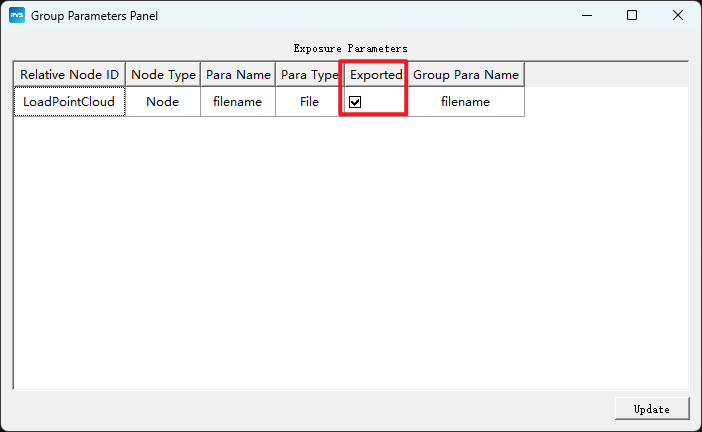
Step three:Select LoadCloud Group to view the exposed
filenameproperties.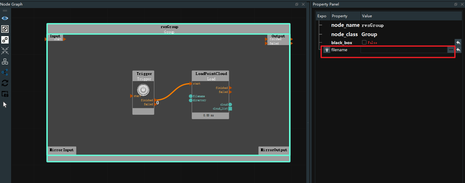
Node Tree
Click on the Node Tree TAB below to switch to the node tree panel. On the node tree panel, you can view the node tree, workflow diagram, and timelist.
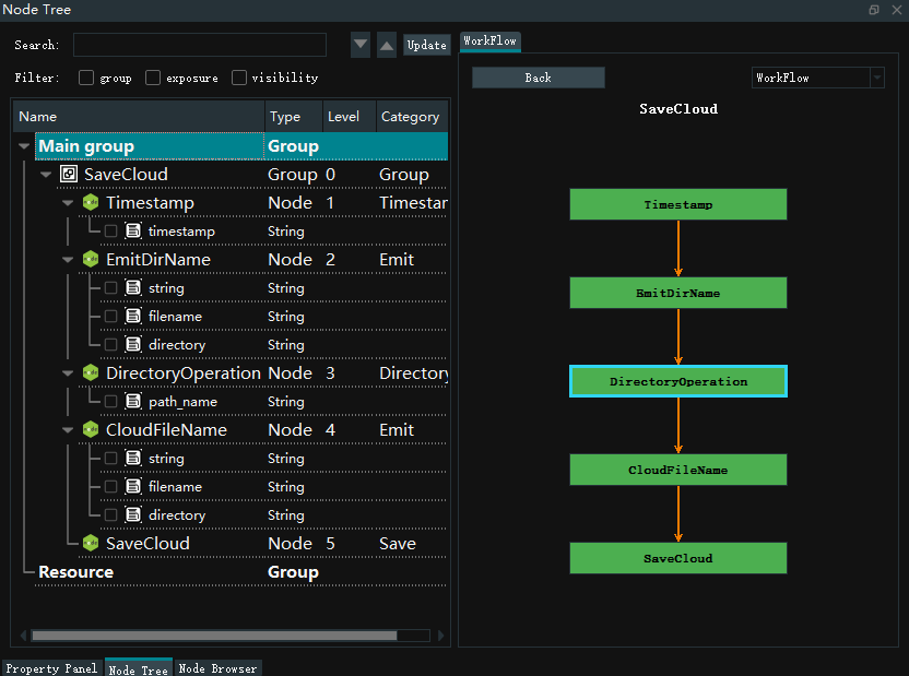
Node tree graph
The node tree is a form of tree to show the hierarchical relationship between nodes and groups in the whole project, as well as the detailed information of nodes and groups. At the same time, the node tree supports searching nodes and filtering information.
详细信息说明
Name:Names of nodes and groups.
Type:Represents the data type.
Level:The representation of the node is encapsulated by several layers of groups.
Category:Represents the node type.
WorkFlow:It is divided into [workFlow](# Workflow) and timelist. Click the drop-down box to switch.
Search node Enter the node name in the search search box and enter enter, you can search in the entire project. Scroll through the up and down keys to find results.
Filter Multiple filters are supported. You can select them as required.
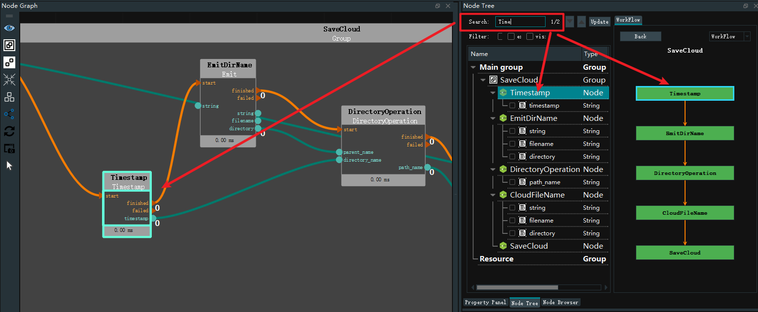
WorkFlow
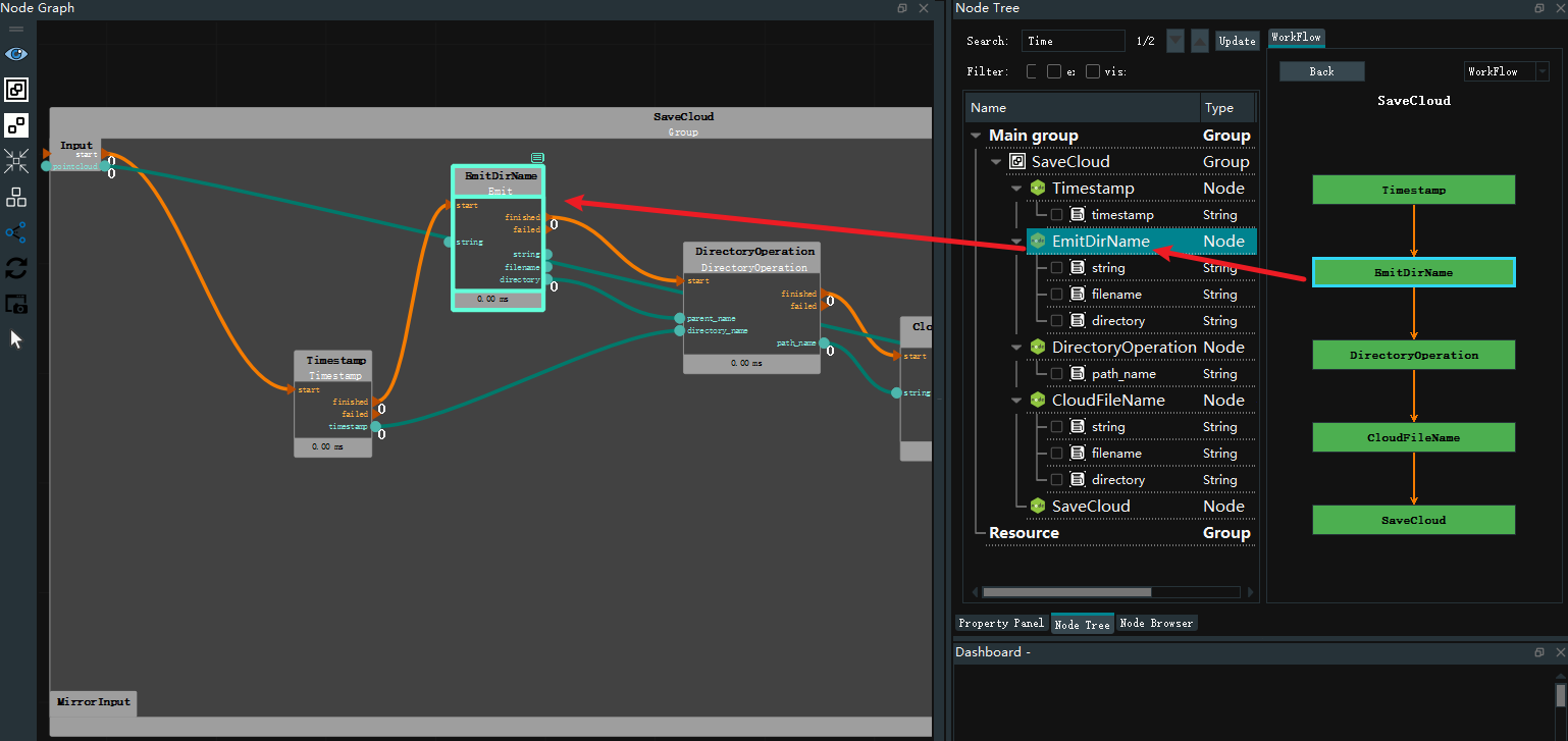
The WorkFlow diagram shows the operation flow of the project. Green for node, dark green for groups. Double click to locate the specified node. Click the Back button to go back to the previous level.
Node graph, node tree and workflow graph linkage. Click a node in the workflow diagram to display it in highlighted form in the node graph and node tree, as shown in the figure below.
LimeList
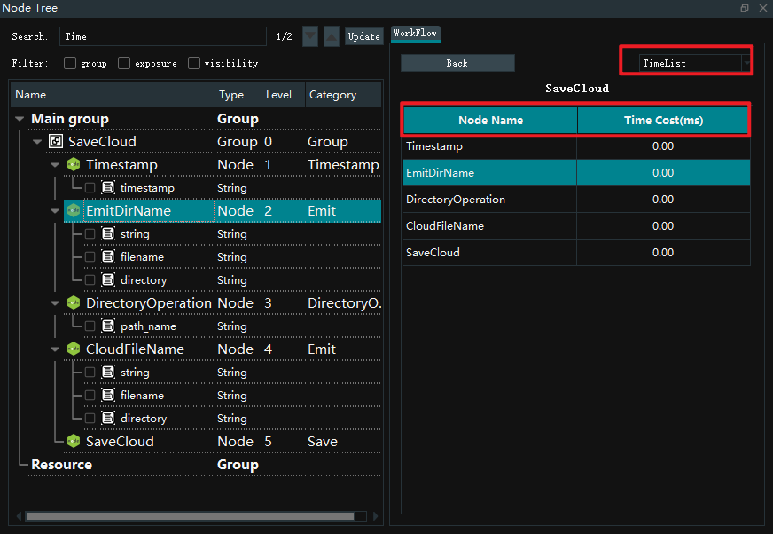
The timelist contains the node name and time cost(ms).
Click the two table heads to sort in descending/ascending order respectively.
Node Browser
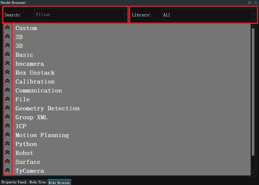
Click on the TAB below to switch to the Node Browser panel. Different types of nodes are shown in the available nodes at the lower part. Click the icon on the left side to expand and fold.
Search node
In use, you need to first enter the node you want in the find node column, or find the relevant entry in the keyword column below.
Folding node list
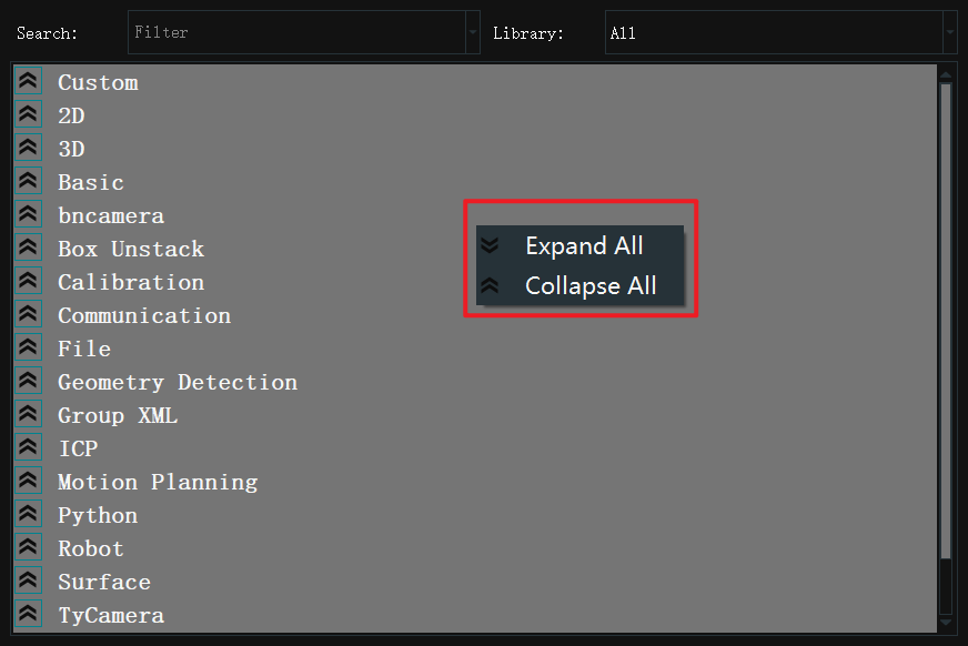
Right-click node browser, pop up the menu bar, click Expand All, can display all nodes in the node browser; Click Collapse All to display the node browser.
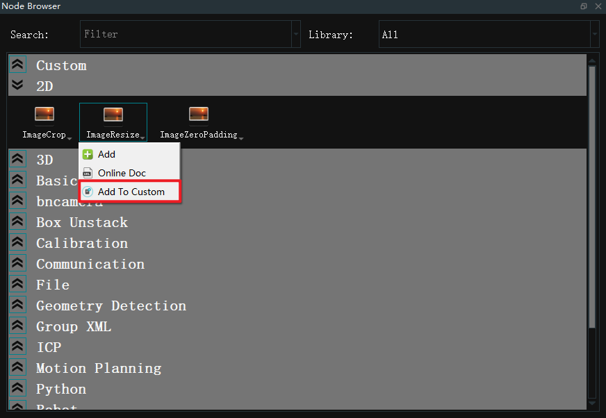
Add To Custom
Custom Add common nodes to quickly add common node, Group XML, and resource class nodes to the Custom library.
When RVS is run again, the previously customized node are retained.
Add custom node method
Find the node, Group XML or resource class node that you want to add, right mouse button click the node entry pop-up menu bar, select Add to Custom.
Delete custom node mode
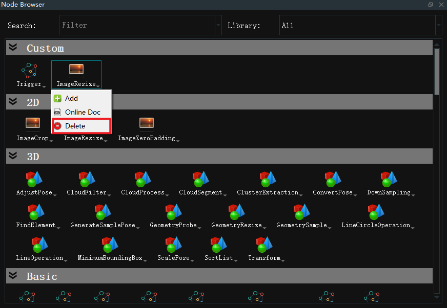
Right mouse button Click the node, Group XML or resource class node entry in Custom and select Delete to delete the specified node from the custom.
Note: In Custom, the Trigger node cannot be deleted.
Custom group.xml
The node list supports the display of custom group.xml.
Add Method
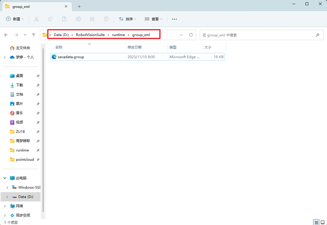
Create a new folder named group_xml in runtime in the RVS installation directory and place the exported.group.xml file in this folder. As shown in the picture below:
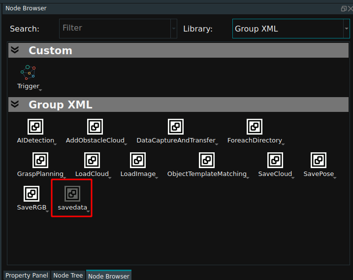
When RVS is opened, the.group.xml placed in the template group library of the node list will be displayed in dark color. The group.xml is used in the same way as the normal node. As shown in the picture below:
Note
1.The file name placed cannot be the same as the name in the existing Group XML.
2.After the file is added, if RVS is enabled, you need to restart RVS to display the added group.xml.
Dashboard
Dashboard to be used with an node has exposure to binding properties.Through the input tool, the bound node properties can be quickly modified, while the output tool can view the output results.
After the interactive panel is unlocked, it is divided into 3 parts, which are Widget Tools, panel, and widget property.
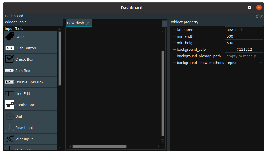
Tools
The tools of the dashboard are divided into output tools and input tools.
Input Tools
The input tool is bound to the input type property.
Label:Use to annotate the functionality of other controls without binding any node properties.Push Button:Attribute of type bool in the binding node. Such as Trigger node trigger, activation, loop properties. Invert values when binding multiple properties.Check Box:Attribute of type bool in the binding node. For example, the Trigger, active, and loop properties of the Trigger node. Synchronize values when binding multiple properties.Spin Box:Attribute of type int in the binding node. For example, the counter attribute of the Trigger node.Double Spin Box:Attribute of type float in the binding node. Such as the coordinate properties in the Emit node.Line Edit:Attribute of type string in the binding node. For example, file and directory attributes in the Load node.Combo Box:Attribute of type enum in binding node. For example, the type attribute in the Load node.Dial:Attribute of type int in the binding node. For example, the counter attribute of the Trigger node.Pose Input:Attribute of type pose in the binding node. Such as the coordinate properties in the Emit node.Joint Input:Vertical Slider:Attribute of type int in the binding node. For example, the counter attribute of the Trigger node.Horizontal Slider:Attribute of type int in the binding node. For example, the counter attribute of the Trigger node.Radio Button for String:Attribute of type string in the binding node. For example, the string attribute in the Emit-string node.Radio Button for Enum:enum type attribute in binding node. For example, the type attribute in the Load node.
Output Tools The output tool is bound to the output type property.
Bool Lamp:Attribute of type string in the binding node. Character 1: true is shown in green, the rest in red.LCD Number:Attribute of type string in the binding node. Such as the Counter string attribute in the counter node.2D Picture:Attribute of type image in the binding node. For example, the image attribute in the Load node.Pose Output:Table:pose property in the binding node property. For example, the coordinate attribute in the Load node.Text Panel:Attribute of type string in the binding node. Such as the string attribute in the Emit node.Grasp Panel:
Panel
The panel supports multiple styles and multiple pages, and a new page can be added by clicking the + icon. After the page is added, modify the parameters in the widget property to make different Settings on each page.
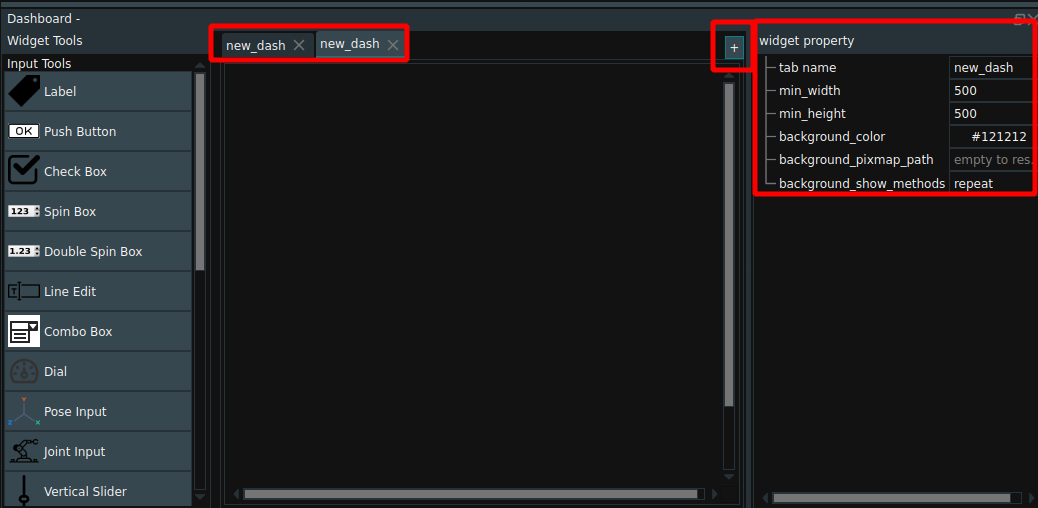
tab name:Set the name of the tab.min_width:Sets the minimum width of the tab.min_height:Set the minimum height of the tab.backgroud_color:Set the background color of the tab.background_pixmap_path:Set the path to the tab background color.backgroup_show_methods:repet:The background image is repeated on the page or in the specified area to fill the entire area.fixed:The background image will be tiled throughout the page.scale:The background image is stretched to fit the size of the entire page or specified area. This can cause the picture to be out of proportion, making it distorted.
Control operation
In the locked state, right clicking in the blank area of the dashboard will bring up a shortcut menu, including:
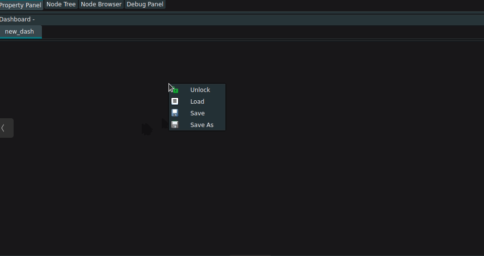
Unlock:Tools that can be added will appear on the left side of the interaction panel after unlocking.Load:Load existing dashboard files.Save:Save the interaction panel as *.dashboard.xml.Save As:Save the interaction panel as *.dashboard.xml.In the locked state, right-click on the interactive panel control to bring up a shortcut menu, including:
BackTrace Node:You can find the node bound to the current control.
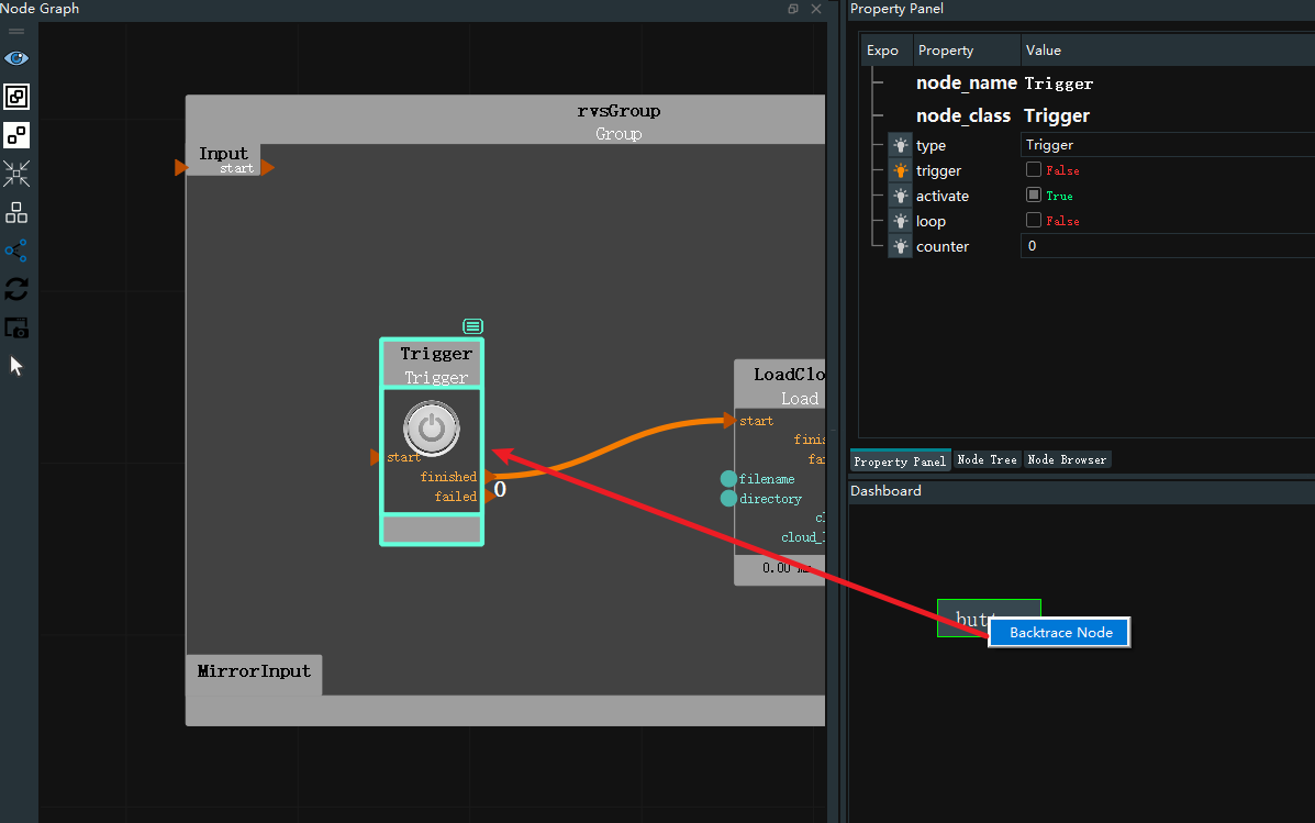 In the unlocked state, right-click in the blank area of the dashboad to bring up a shortcut menu, including:
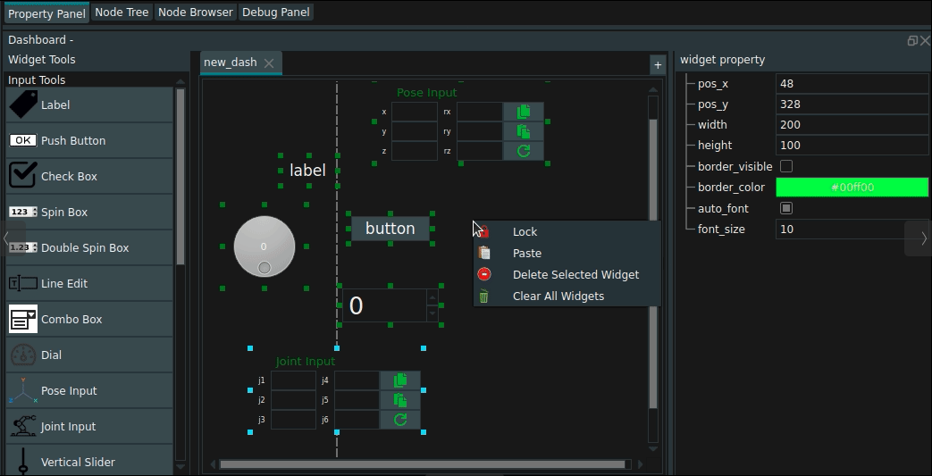
Lock:The new widget is added.Paste:Save the tools in the current interaction panel as *.dashboard.xml.Delete Selected Widget:Delete the selected control.Clear All Widget:Delete all added controls from the interaction panel.
In the unlocked state, add, modify, and delete controls in the interactive panel:
Append:Mouse Click the tool or mouse click the tool and drag it to the desired position to release.Edit:Resize a tool:Move the mouse over the tool border, the mouse style changes, Drag the mouse to resize the tool.
Modify tool location:Hold down the mouse left button to move to change the position of the tool.
Modify the content of the tool:Left mouse button Double click, cursor modification appears. Only some tools can be modified, such as labels, buttons, etc.
Delete:Select the tool mouse right-click after the menu menu delete or keyboard delete key delete.
Widget property
Select the tool, and the corresponding tool properties are displayed. Here, the button tool is used as an example to introduce the widget property in detail.
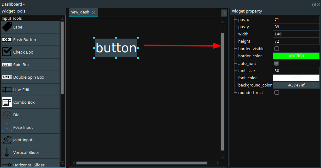
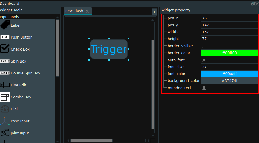
pos_x:Set the position of the top left corner of the tool in the horizontal direction.pos_y:Set the position of the top left corner of the tool in the vertical direction.width:Set the width of the tool.height:Set the height of the tool.border_visible:Sets whether borders are displayed.bordr_color:When the Display border is checked, you can set the tool border color.auto_font:Sets whether the font is resized with the tool.font_size:If the adaptive font is not selected, you can adjust the font size using the font size setting.font_color:Set the font color.backgroud_color:Set the background color of the tool.rounded_rect:Sets whether to set the tool as a rounded rectangle.
Operation example
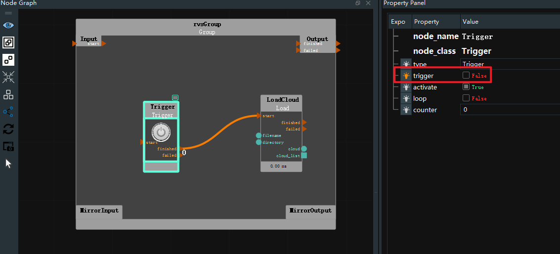
Take the binding of Trigger attribute and button tool in trigger operator as an example.
Operation steps:
Step one:Select the Trigger operator and set its property ‘trigger’ → Exposure.
Step two:Click the blank space of the interactive panel to pop up the menu bar, click Lock and select the Button tool.
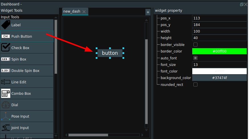
Step three:**Double-click ** button tool, modify its name as Trigger, Enter to complete the renaming.
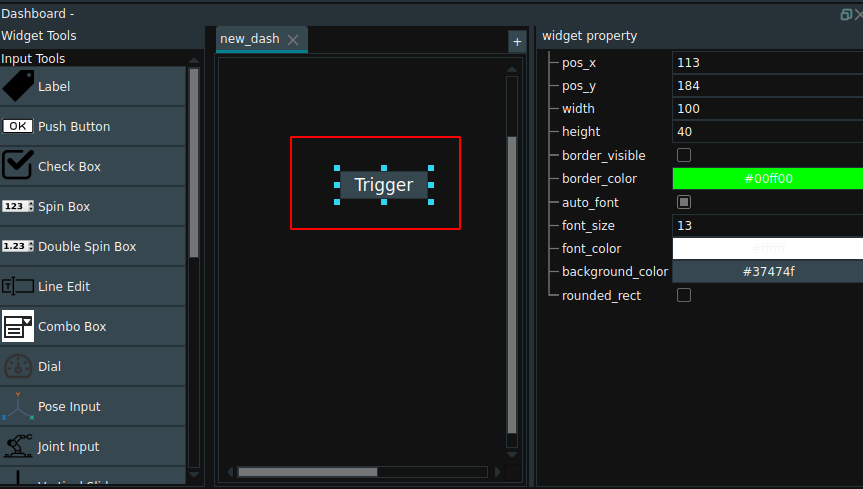
Step four:In the widget property to adjust the button tool parameters, **right click ** dashboard blank, pop up the menu bar, select Lock.
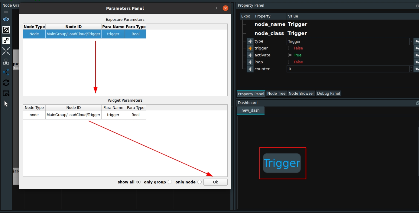
Step five:Mouse middle key click Trigger button, pop-up parameter panel, double-click exposure parameters, complete the control parameter binding. Click OK.
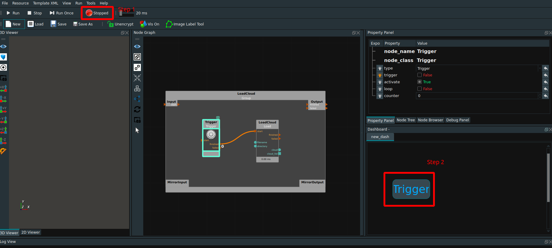
Step six:Click the Run button of RVS and click the Trigger button to run the project.
One to many mode
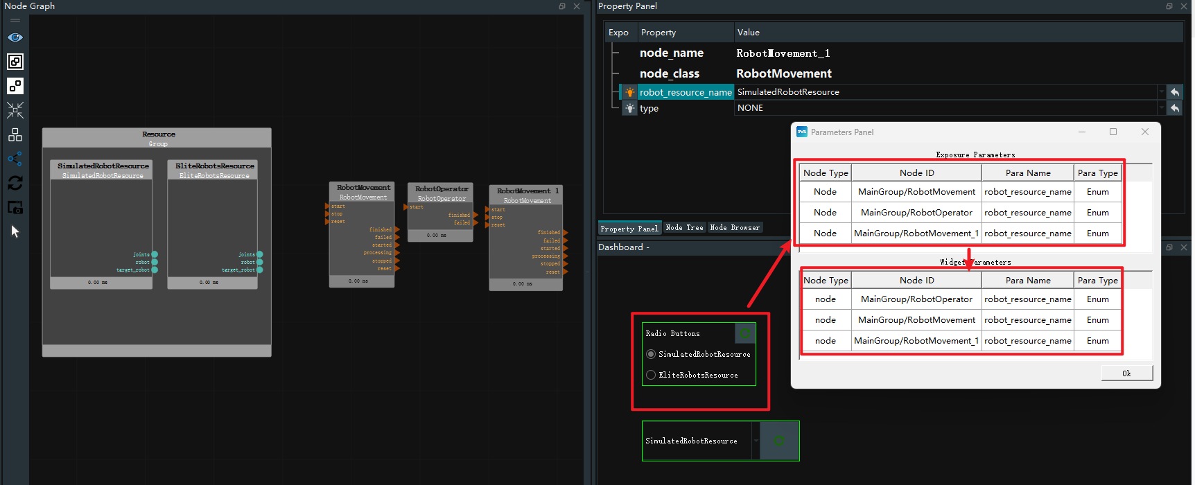
The input tools Combo Box and Radio button for Enum in the interactive panel support one-to-many mode. When multiple nodes are bound with the same properties, the robot resource name shown in the following figure can be switched between offline and online resources by clicking Combo Box or Radio button for Enum in the interaction panel. It can improve the flexibility and efficiency of engineering projects and facilitate users to adjust parameters quickly.
Log View
The log view is used to record audit logs of user operations in RVS. It can also meet the requirements of the supervision function, and can quickly locate the root cause of problems when problems occur, and track the process of program execution and data changes.
 Log views include:
Configure Log channels Display:Click the button will pop up the Set Log level for LogView dialog box, and make the relevant Settings.Search Log Entries:According to the channel, Severity, the contents of the message search, if has the related content, Log will refresh the display box shows the Log information containing the search content. At the same time, you can clickClearon the right side to clear all logs.Search Log Entries:Default number of entries: 200. There is no maximum limit.TimeStamp:The time the Log was generated.Channel:The source of the Log message.Severity:The security type of this Log.Message:The contents of this Log.
Log display description
Logs are displayed in severity to minor as follows:
fatal:fatal。The background is red.error:error。The background is red.warning:warning。The background is yellow.info:info。Default background color. If the output string content begins with “[H]”, it is highlighted in blue.debug:debug。Default background color.trace:trace。Default background color.
Set Log
Log configuration steps are as follows:
Click the
Configure log channel displaybutton. The Set Log Security Level dialog box is displayed.In the
Enablecolumn on the left of the dialog box, select the channel to be enabled, and set the corresponding security level of the channel on the right. When a certain security level is selected, it means that the current channel will only show the current security level and the more serious security level information in the log view.Optional : To set all channel security levels with one click, check
Allat the bottom of the dialog box and select the security level.




 Run:Cycle the current entire project until it is manually stopped.
 Stop:Manually stop the project that is running in cycle.
 Run Once:It is used to run the entire project once and stop after running it once.
 (Red button)Stopped:Indicates that the current project is in the stopped working state.
 (Green button)Running:Indicates that the current project is in the working state of cyclic operation.
 (Yellow button)Initializing:Indicates that the current project is in the initial working state.
 Unencrypt:When the project xml is not encrypted, you can freely view and edit the xml. Default: No encryption.
 Encrypt:When the project xml is encrypted, it cannot be opened and must be decrypted.
 Vis On:Open all displays in 2D and 3D views. Default: Display on.
 Vis Off:Turn off all displays in 2D and 3D views. Turning off global display improves RVS operation efficiency and is suitable for optimal operation efficiency of test projects.
 Image Label Tool:Annotation tool for training images.
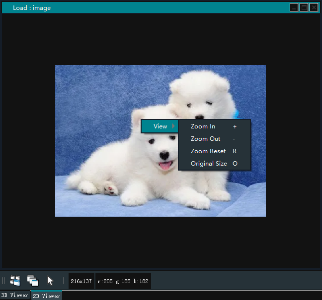
 Switch Parallel Projection Off:Pull the current view further away or closer.
 High Quality ScreenShot :Save an HD screenshot in the runtime folder in the RVS installation path. You can also use the shortcut Ctrl+K key to take high-definition screenshots.
 Set View Direction to + X :Set +x to the main view.
 Set View Direction to - X :Set -x to the main view.
 Set View Direction to + Y:Set +y to the main view.
 Set View Direction to - Y:Set -y to the main view.
 Set View Direction to + Z:Set +z to the main view.
 Set View Direction to - Z:Set -z to the main view.
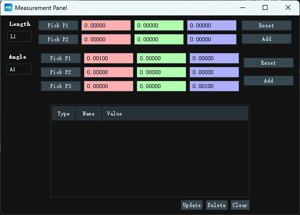
 Measurement:Used to measure length and Angle. Click the icon to pop up the Measurement Panel dialog box, set the length/Angle name, click
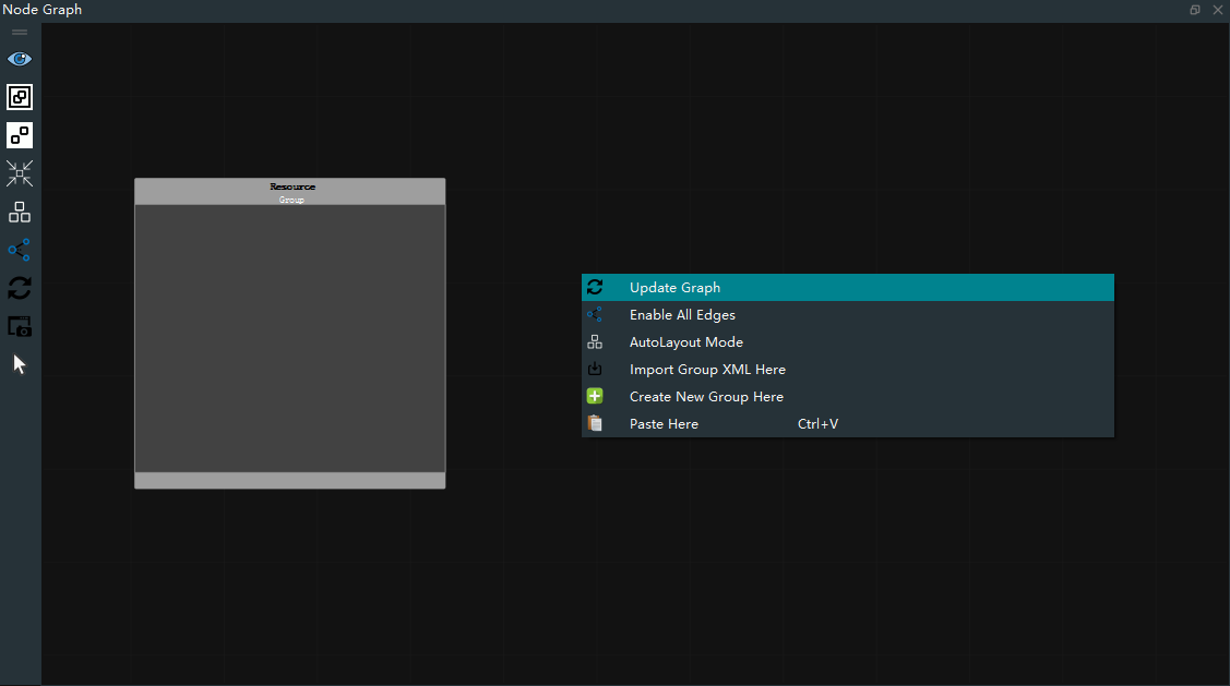
 Input Group XML Here:Select group.xml in the local path to import.
 Create New Group Here:Create a new blank Group.
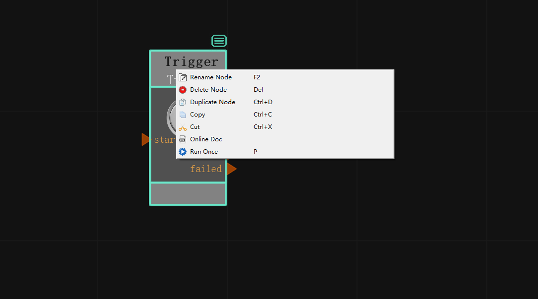
 Rename Node:Renames the node.
 Delete Node:Delete the node.
 Copy:Copy the node to the paste board.
 Cut:Cut the node to the paste board.
 Online Doc:Click to jump to the node’s online documentation.
 Run Once:Run this node once alone and do not trigger other nodes to run later.
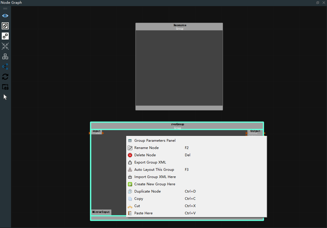
 Group Parameters Panel:Click on the **Group Parameters Panel ** dialog box, which contains an overview of all exposed node parameters in the Group.
 Export Group XML :Export the group as a group.xml file.